

When Princess Maker 2 Refine came out on Steam last fall, its appearance shocked me. Not for its release (if anything, that was overdue, given that it already had a following in the west thanks to fan-translations and walkthroughs) but for its actual appearance. The art I knew and loved was gone, and with the release of Princess Maker Refine last week I've got a serious case of déja vu.Each installment in the Princess Maker series puts players in charge of the upbringing of a very young girl, giving them the control to decide what she studies, where she goes, what hobbies she pursues, what clothes she wears and even what part-time job she gets to earn money once she's old enough. If she's overworked she can develop a rebellious streak and take things into her own hands, of course, but the idea is that the player is directing her towards a future as a well-rounded and successful adult. She can end up in a variety of different careers and circumstances depending on how she's raised.There's a lot to love about Princess Maker, generally speaking. Even taking some of its creepier paternalistic undertones (and overtones) into account, it's one of the first games I ever played where I felt like my interests in more socially-oriented mechanics (including character appearance) weren't just superficial wastes of time. Fundamentally, the Princess Maker games are about nurturing—and that sets them apart even in the current age of the ruggedly unshaven, shotguns-and-lullabies videogame dad.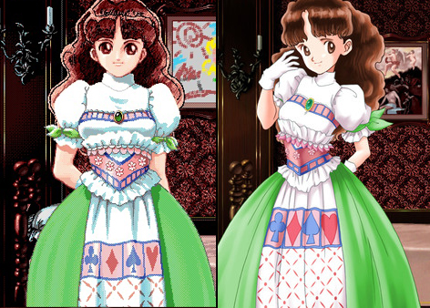 Then there's the look of it… Or, more specifically, the look of the originals.Nostalgia or not, Princess Maker and Princess Maker 2's original artwork is exceptional. Even though I didn't spend my childhood fussing with DOS like many did I can still see the appeal of all that digital pointillism lovingly rendering every weft of dark auburn hair and every pale, lacy ruffle. It's true that dithered artwork hasn't been as widely re-popularized as plain old pixels, but that doesn't make it any less worthy of appreciation.But then you have the Refine artwork. No more dithering, no more crisp pixel edges; just lifeless turn-of-the-millennium digital airbrushing and the occasional bit of wonky linework. For context, neither Princess Maker Refine nor Princess Maker 2 Refine are new remasters. Both came out in Japan in the early 2000s, so the newest part of each package is the localization rather than the artwork. Ergo Princess Maker Refine's art decisions were made long before dithering fell back into fashion. At the time the look was simply synonymous with tech that was old and dated — tech that could be improved upon.The real problem isn't purely stylistic, it's that those improvements now look old and dated. If you've ever fallen down into the rabbit hole of looking at the first few rounds of comic book covers that were colored digitally then you probably know exactly what I mean. That uncanny smoothness. That MSPainted awkwardness.As someone who put hours into these games, who fiddled with emulators and guides and unofficial patches in order to play, it feels just a tiny bit tragic to finally have official access to them in English without that beautifully crunchy original artwork, or even the option to toggle between the two styles. These games are still a must-play for fans of newer raising-sim releases like Long Live the Queen, but if you pick up either of the Refine versions (and have an appreciation for retro game graphics) please do yourself a favour and look up what these games once looked like. As far as I'm concerned that airbrushed look just can't quite compare.
Advertisement